Introduction
A year ago when I reviewed the Galaxy Note9 I remarked that it was “the most feature-packed smartphone that you can buy right now”. This year, the Galaxy Note10+ seeks to carry on the Note lineage by being, once again, the palm-sized conduit for Samsung’s latest and greatest mobile technologies; and on paper – save for a couple of omissions – this truly is the no-compromise phone, and then some. But does it stack up in real life? More importantly, how does it compare to last year’s Note9 and other, cheaper flagships, and does it justify the heavy starting price of S$1,598?
Specifications
- 162.3 x 77.2 x 7.9 mm, 196g
- IP68 dust/water resistant (up to 1.5m for 30min)
- 6.8” 1440 x 3040 19:9 HDR10+ Dynamic AMOLED Screen (~498 ppi), Gorilla Glass 6
- Exynos 9825 (7 nm), Octa-core (2×2.73 GHz Mongoose M4 & 2×2.4 GHz Cortex-A75 & 4×1.9 GHz Cortex-A55), Mali-G76 MP12 GPU
- Slot for microSD expansion up to 1TB OR second SIM
- 12GB RAM, 256/512GB UFS 3.0 storage
- Triple camera: 12 MP, f/1.5-2.4, 27mm (wide), 12 MP, f/2.1, 52mm (telephoto), 16 MP, f/2.2, 12mm (ultrawide)
- 4K@30/60fps, 1080p@30/60/240fps, 720p@960fps
- Selfie camera: 10 MP, f/2.2, 26mm
- Stereo speakers
- 4300mAh battery, 25W fast charging, up to 45W with compatible charger
- USB-C, NFC, Bluetooth 5.0, Ultrasonic under-display fingerprint scanner
- Colours: Aura Glow, Aura White, Aura Black
Design & Build
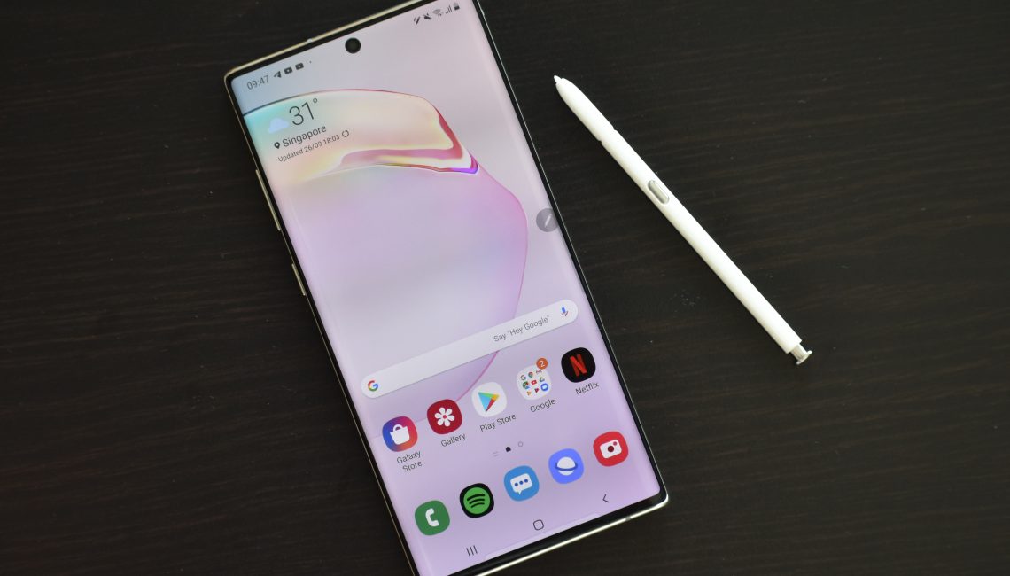
There’s no debate, the Note10+ is an absolutely stunning piece of hardware. I’ve had the chance to review both the Aura Glow and Aura White models, and they are both beautiful in their own way; the Glow is the physical embodiment of a psychedelic acid trip, while the White is an understated elegance. Interestingly, the colour of the included AKG earphones and charger are white for the White Note10+ and black for the Glow.
Whichever colour you choose, the build quality is Samsung at its most refined, with glass and metal melting seamlessly together, and the nerdy horizontal camera layout of the Galaxy S10 series giving way to a much more charming vertical placement. However, this particular improvement in looks does come at a minor price, seemingly overlooked by Samsung’s engineers – the Note10+ rocks about on the table when one writes on it with the SPen due to the non-central placement of the camera bump. It is ironically something which wouldn’t matter on literally any other phone, and isn’t a major issue, but it is nonetheless an annoyance which I’ve noticed.
The feel in the hand is solid, and I have a personal penchant for the Note series’ blockier design with its squared-off corners and flat top and bottom edges (it leaves me nostalgic for old Nokias and Sonys), but there will be many who would prefer the more ergonomic rounded corners of something like the Galaxy S10, since those would not poke into the palm of the hand.
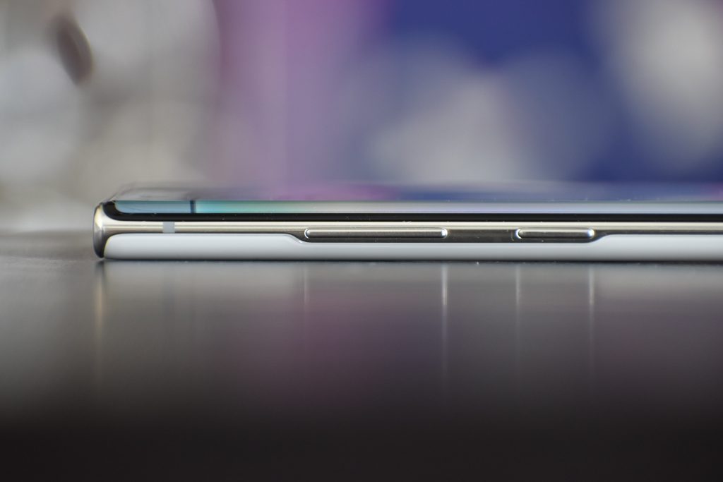
Aside from the fact that the Note10+ looks and feels great, there are other tiny technical feats over last year’s generation of Note – it’s lighter and nearly a millimetre thinner, while having a much larger edge-to-edge screen (6.8” vs 6.4”), and a larger battery (4300mAh vs 4000mAh).
The main issue that I had with the build of this year’s Note is that the large curved screen makes it a challenge to reach across it one-handed without touching something else by accident. Oftentimes I would accidentally tap ‘p’ on the keyboard when reaching for a ‘q’, or tap on an item on the screen when trying to swipe in from the left edge to open the hamburger menu in the Play Store. To be fair, this is not a fault of the Note but rather an inherent characteristic of it; as much as I would want to use the Note10+ one-handed, it is intended as a two-handed phone, and as long as you keep your expectations in line with this being a two-handed device, everything is fine.
One final thing to note about the hardware is that all the buttons are now on the left-hand side of the device, as Samsung has decided to merge the power button and the Bixby button into a single button which it calls the “side key”. By default, a double press launches the camera (as it should), but a press and hold launches Bixby. Samsung’s workaround to this is to make the power menu accessible from the notification panel, but you can also opt to change this in Settings so that the side key functions as a regular power button, effectively disabling Bixby. The physical implication of having the power button on the left side of the device is that right-handed users now have to shift the phone in a way that makes the button accessible to their right index or middle finger every time they want to sleep or wake the phone. It was a strange inconvenience at first, but quickly became something I got used to.
Display & Audio
The Note series traditionally has had the best display in a smartphone, and by every conventional metric, the display on the Note10+ excels – it’s got excellent vibrancy, contrast, resolution and brightness, is colour accurate and even HDR10+ certified. It is without a doubt an absolute joy to look at. The only notable omission from the display is a high refresh rate.
The lack of a high refresh rate display is a notable omission
At this point you either agree or are clueless as to what high refresh rate means. A high refresh rate display – that is, higher than the conventional 60Hz – makes animations appear smoother, giving the impression of superior speed and responsiveness.
Such a technology has been mainstream in the gaming industry for a long time, but has only recently started to trickle down to tablets and smartphones. If you’ve ever noticed how an iPad Pro’s display appears “smoother” than that of a regular iPad’s, that would be because the former has a higher refresh rate. Granted, high refresh rate is still a nascent technology in the smartphone industry and has yet to go mainstream, so it is likely that the majority of consumers will not notice or care about its absence on the Note10+. Still, with companies like OnePlus pushing out devices with 90Hz (Samsung-made) displays like the OnePlus 7 Pro and 7T, I would expect this technology to become mainstream by next year, and would be surprised if Samsung does not include it in its S11 or Note11 series of phones.
It is worth noting that the other thousand-dollar phone, the brand-new iPhone 11 Pro, also does not have a high refresh rate display, so Samsung isn’t losing out to Apple on this front at least.
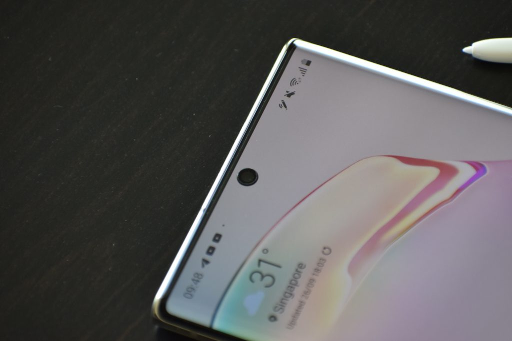
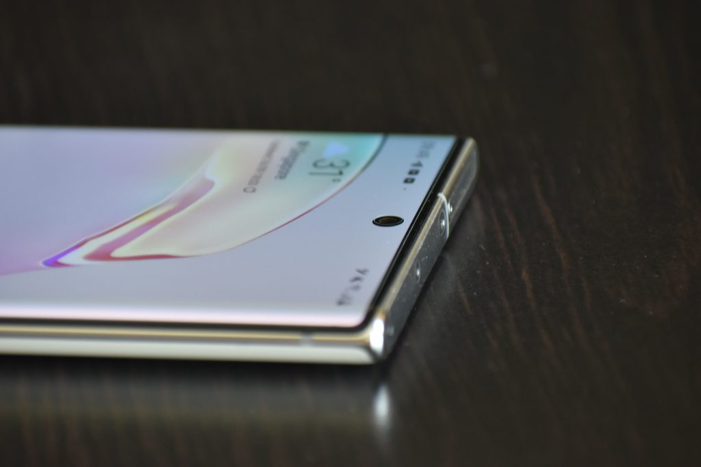
Moving on to other aspects of the display, Samsung has opted for a “hole-punch” cutout for its front camera, what it dubs the Infinity-O display. Unlike the S10 series of phones which have the cutout on the upper right side of the display, the Note10+ has opted to have it in the centre, so symmetry is restored. I do not mind this implementation – Samsung has even made the cutout smaller compared to the S10 series – and I find it to be less intrusive than the “teardrop” notch on my OnePlus 6T.
The move to an Infinity-O display has allowed Samsung to stretch the screen edge-to-edge, drastically increasing the diagonal size to 6.8” up from the 6.4” of the Note9 while maintaining roughly the same physical dimensions of the phone. This, coupled with the miniscule bezels around the display – just look at the difference between it and my OnePlus 6T – makes for an all-screen look and a truly immersive experience. Still, I can’t help but wonder if Samsung will embrace a fully notchless design next year; it’s already experimenting with swivel cameras on its A series of phones.
Unfortunately, there are some downsides to this immersive display. Other than the aforementioned accidental presses, the single hole-punch means that Samsung has had to leave out things like the iris scanner and notification LED present on the Note9 (though I doubt they will be missed); and while Samsung has still managed to provide stereo audio via the earpiece doubling as a speaker, the thin slit design of the earpiece is probably to blame for the fact that the back of the phone vibrates slightly when playing audio – not a deal-breaker, but it is noticeable. The curved screen also means my usual complaint of light catching on the curve when watching video.
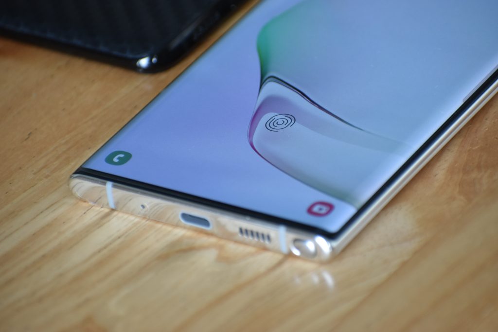
Speaking of audio, the stereo speakers on the Note10+ are excellent. They are loud and clear, and even though one of the speakers is sideways-firing when the phone is in landscape, I could hardly tell given the rich stereo separation. There is no 3.5mm audio jack on the phone, but Samsung provides a good pair of AKG USB-C earphones in the box, and I guess it was about time. Some argue that this omission is a slap in the face especially for Note owners – who are all about that no-compromise lifestyle – but I personally cannot understand the fuss over the culling of jacks. Jack is dead, so buy a pair of Bluetooth earphones or use the included USB-C ones, and get over it.
Under the display is the ultrasonic fingerprint reader. While most early reviewers criticised its poor speed and accuracy, Samsung has drastically improved its performance in a software update in August. The fingerprint reader is now the best under-display unit that I’ve used; it’s extremely fast and accurate and I have absolutely no complaints.
Software
That provides me with a nice segue into the software. Since receiving the phone, I’ve had two software updates providing the August and September Android security patches respectively. Other things in the changelog include the aforementioned improvement to the fingerprint reader, as well as improvements to the camera, touchscreen and audio quality through wired headphones. Samsung appears to be taking software updates seriously with the Note10+, and this is an extremely welcome move. There are also reports that Samsung is already testing Android 10 on the Note10+, so hopefully that update will come shortly.
This also happens to be my first experience with Samsung’s redesigned OneUI skin, and I am generally a fan. Samsung has taken great strides in cleaning up the UI. Apps can be hidden from the app drawer, you can set a swipe down gesture on the home screen to pull down the notification shade (a must-have for a device this large), and there is an in-built dark theme dubbed “Night mode” which not only changes most of the UI black but also most notifications.
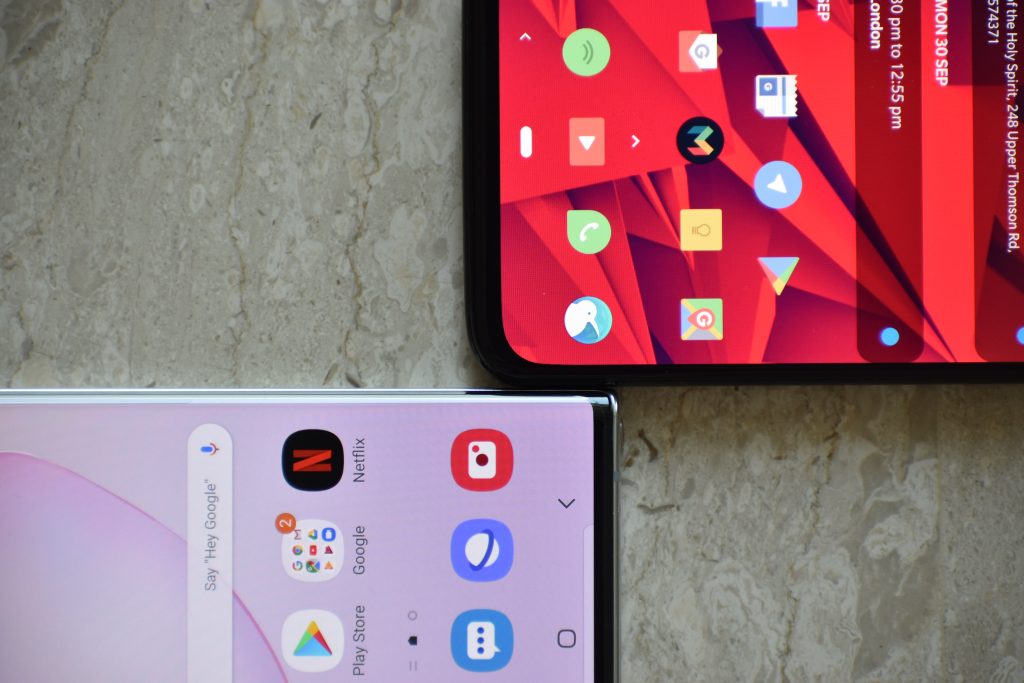
Samsung has done such a good job with the software that my complaints are mostly nit-picking at this point, and hilariously enough most of it has to do with Settings. OneUI’s Settings page looks neat but still managed to confound me, with certain settings buried deep within menus or additional options being hidden away in three dots on the upper-right corner. Samsung seems to be aware of this, and tries to help you out by including a “Looking for something else?” section at the bottom of each page to suggest items that may have been arbitrarily placed in an adjacent settings category. Thankfully, there is a search button, but sometimes this still requires you to have knowledge of what Samsung calls certain things. Searching “button” brings up no options to adjust the settings for the power button because Samsung calls it the “side key”. Even then, settings for the side key are inexplicably under “advanced features”. Many items in the settings menu that appear as toggles also have additional settings, only accessible when you click on the text and not on the toggle, which I did not find very intuitive.
I am fully aware of the ridiculousness of writing an entire paragraph to criticise the Settings menu, but it should be taken as a compliment because OneUI is so clean otherwise that I have nothing else to complain about. Hopefully Samsung will be able to clean this up to make it more user-friendly.
Camera & SPen
The camera on the Note10+ is excellent. Images taken have noticeably better dynamic range and detail compared to the mediocre unit on my OnePlus 6T. A dedicated night mode also does wonders for brightening up dark images without blowing out the highlights, while recovering some saturation in colour. I do wish that night mode was something that automatically kicked in when the phone detects a dark scene like in the new iPhone 11 models instead of a dedicated mode, but this is personal preference.
The camera supports so many different capture modes that it can be dizzying (there are a total of 11: Food, Night, Panorama, Pro, Live focus, Photo, Video, Live focus video, Super Slow-mo, Slow motion, Hyperlapse), but Samsung has thankfully provided the ability to disable or rearrange the less frequently used modes.
Video on the Note10+ is excellent. You can record 4K 60fps with excellent colour and dynamic range, and Samsung has further improved video stabilisation for a super steady shot. There is also a very feature-rich in-built video editor on the phone.
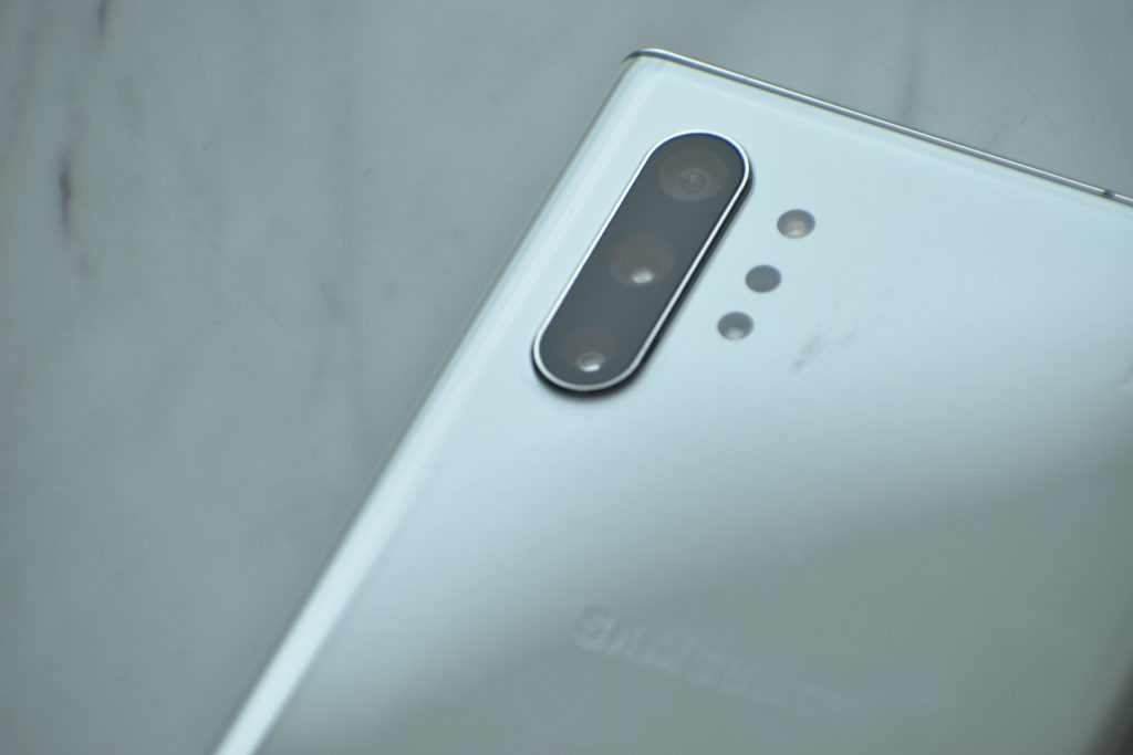
This year, the SPen has been updated to include a gyroscope, and one of the headlining new features of the SPen is the ability to do gestures with it to control certain functionalities within the camera app such as switching between modes or to the front camera. It works, and is welcome functionality, but it seems to be limited to a rather specific and rare use case.
Speaking of the SPen, it’s got all the features of the previous Notes, with some welcome improvements to the Samsung Notes app such as the ability to search specific words in handwritten text. The SPen is the defining feature of the Note, now more so than ever, and while it’s not a must-have for me personally, it is certainly welcome when the need to use it arises, like when cropping or doodling on screenshots. Unfortunately, you really need to have owned a Note to know if the SPen is something that you’d love or barely use; I wouldn’t be able to judge for you. I personally know of Note owners who constantly use the SPen, and if you’re one of those people, you’ll love the refinements that Samsung has made this year.
Performance & Battery Life
The Note10+ is the best performing phone I have used to date, period. The Note10+ comes standard with 12GB of RAM, double that of my OnePlus 6T, and the number of apps that it can keep in memory is ridiculous. I can’t recall if I’ve ever seen the phone reload an app. The SoC in the Singaporean variant is Samsung’s own 7nm Exynos 9825, and it is comparable to Qualcomm’s Snapdragon 855 in pretty much every way.
Many people do not know this, but the type of flash storage on your phone has a major impact on the speed of the device, from things like installing and opening apps to the long-term speed of your phone. The Note10+ has the latest UFS 3.0 storage which is stupid fast, and apparently Samsung has made it even faster by switching to the F2FS file system, making it apparently the fastest storage on any Android phone.
Battery life on the 4300mAh battery is excellent, and I am able to make it comfortably through a day without ever worrying about charging the phone. Most notably, the phone ships with a USB-C to USB-C 25W charger in the box, which charges really quickly: it takes less than an hour to go from 40% to full in my testing, and you can even bump it up to 45W if you purchase the compatible brick from Samsung.
Other miscellaneous items that I haven’t mentioned include the wonderful haptics present on the device. Samsung has improved the vibration motor such that it is context-specific, providing satisfying little clicks when doing things like highlighting text. There is also an improved Samsung Dex, which now works on Windows and Mac for you to drag and drop items between your phone and your computer, or to access phone apps in windows on your computer. Previously, you would require a special dock and an external monitor and keyboard. Oh, and there’s a time-of-flight depth camera on the back of the Note10+ that is not present in the regular Note10. It’s meant to help in things like 3D capture or AR doodles, but its practical utility is not apparent to me at the moment.
Conclusion & Pricing
After using the phone for roughly two weeks, my conclusion boils down to this. As always, the Galaxy Note is the pinnacle of what Samsung has to offer, with only two notable omissions: the headphone jack and a high refresh rate display. Whether or not you should purchase this phone comes down to whether or not those two omissions are deal-breakers for you, how much you like the design and display, and how much you want the SPen and its accompanying software features. I’m going to bet that the omissions are not deal-breakers for the vast majority of people, and that the design and aesthetics of the phone alone is enough to win people over, even those still unconvinced about the utility of the SPen.
Ironically, my main issue with the Note lies in the very essence of what makes the Note great – it’s got every single feature conceivable, which inevitably means that there will be a lot of confusion and messiness in the software (like in the settings and camera apps as mentioned earlier). This review is already almost 3000 words long, and I am sure that Samsung will be quick to point out to me that I still haven’t gone over all the features of the phone – like Edge lighting or AR doodle or live focus video – to which I would reply that it is virtually impossible to review every single feature of this phone. The Note10+ is the most Samsung Samsung phone, which means that you either love and appreciate the richness of features that Samsung has crammed into the Note, or are daunted or even put off by it.
If you are willing to sit down with the phone for several hours to crawl through the maze of settings available, you will likely find pleasant surprises, and eventually you’d be able to set up the phone just the way you want it. Alternatively, if you find it all too overwhelming, you could choose to ignore the wealth of software features and settings available; but you wouldn’t get the most out of your money spent, and this defeats the whole point of buying a Note in the first place.
Clearly the latter option is unideal, and Samsung has much to gain in ensuring that potential consumers are not daunted by its software. OneUI was a step in the right direction, but Samsung still needs to do more to clean up its software, namely remove redundant or unused features, and tidy up menus to make them more accessible and user-friendly. For instance, there are currently 3 separate email apps installed on the phone out of the box – Samsung Mail, Gmail, and Microsoft Outlook; just Gmail will suffice. As of now, OneUI looks clean on the surface, but feels to me somewhat like the UX equivalent of sweeping things under the carpet.
Just tidy up the software a little more, keep up the regular software updates, and the Note will be near-perfect.
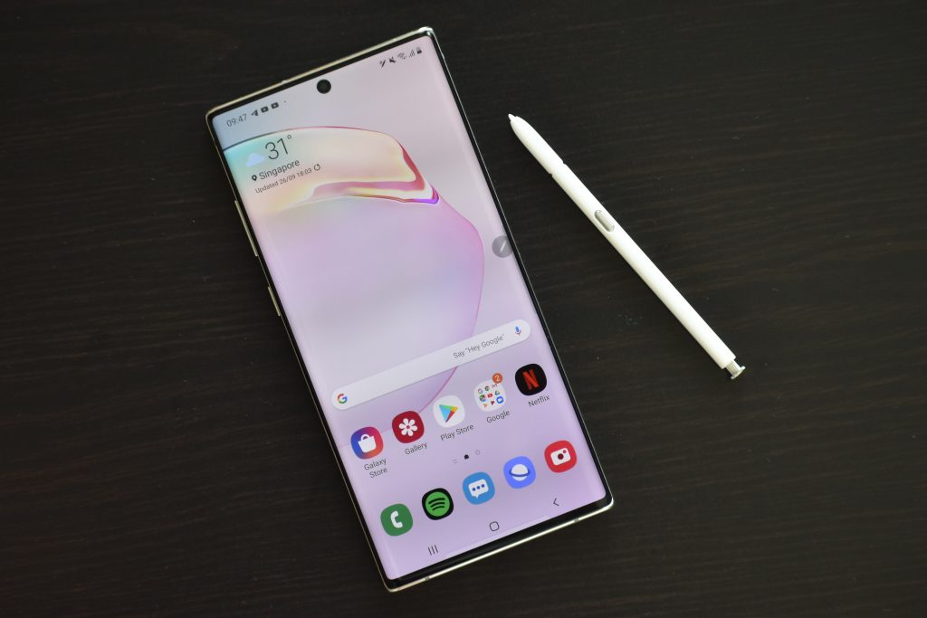
This year, Samsung has opted to release two versions of the Note: the Note10+ and the Note10. The latter is a smaller version of the former, and correspondingly has a lower resolution and smaller screen, less RAM (8GB vs 12GB), no microSD expansion, and smaller battery (3500mAh vs 4300mAh), for S$200 less on the base model. I’d say that the additional S$200 is worth it.
If you are considering the Note10+, you might also be considering the Galaxy S10 or S10+, which go for cheaper while delivering much of the same specs. It all boils down to which design you like more, and how much you value the SPen.
You can purchase the 256GB/12GB RAM variant of the Note10+ direct from Samsung at S$1,598, or the 512GB/12GB RAM variant for S$1,898, in Aura Glow, Aura White, or Aura Black. As always, be on the lookout for telco deals, trade-in specials, and remember that you can use ShopBack to get cashback on Lazada purchases.

