When I first heard about the Nothing Phone (1), I was rather dismissive of it. The product of OnePlus ex co-founder Carl Pei. An invite system à la the OnePlus One. Lights on the back that seemed like nothing more than a gimmick. I knew what it was like to be swept up by the hype of a young upstart, only to be disappointed and abandoned a few product generations later.
Perhaps I didn’t think much of the Nothing Phone as I assumed that it wouldn’t be available in Singapore due to its limited launch. But it’s here, and I got one in for review. So let’s see if a couple of weeks with the Nothing Phone (1) changed my initial perception of it. As always, we start with the specs.
Nothing Phone (1) Specifications
- 159.2 x 75.8 x 8.3 mm, 193.5g
- IP53 splash, water and dust resistant
- 120Hz 6.55″ 1080p OLED, HDR10+
- Snapdragon 778G+
- 8/128 (S$769), 8/256 (S$869), 12/256 GB (S$949)
- 4500mAh battery, 33W charging
- Cameras
- Main: 50 MP, f/1.9, 24mm, 1/1.56″, 1.0µm, PDAF, OIS
- Ultrawide: 50 MP, f/2.2, 114˚, 1/2.76″, 0.64µm, AF
- Front: 16 MP, f/2.5, 1/3.1″, 1.0µm
- Misc: Stereo speakers, no 3.5mm headphone jack, Bluetooth 5.2, under display optical fingerprint reader
- Colours: White, Black
What I liked
Display
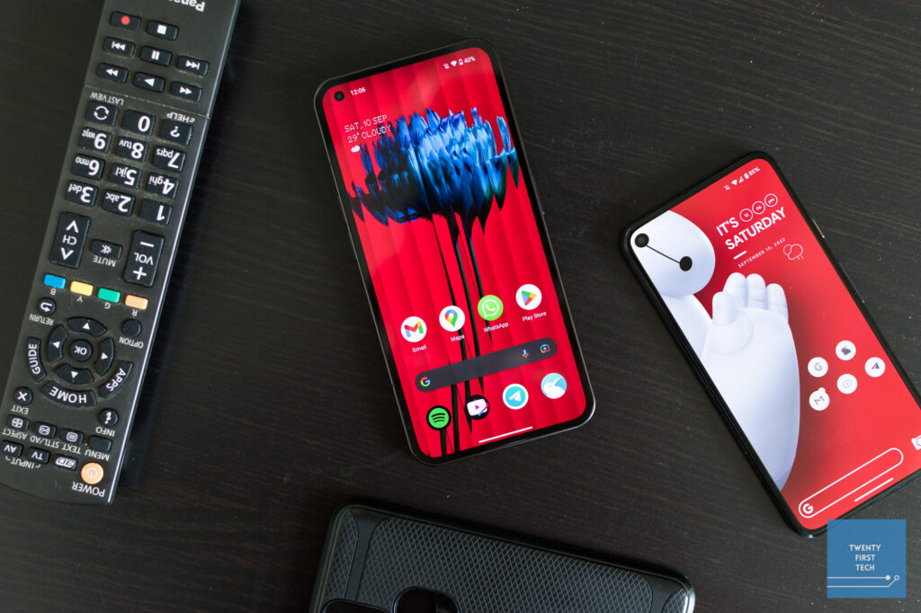
The Nothing Phone comes with a large 6.55″ display. Being an OLED, it provides rich, vibrant colours and inky blacks. It also gets plenty bright outdoors and supports HDR10+ in apps such as Netflix. Perhaps most importantly, it has a high refresh rate of 120Hz, so animations in the UI and most apps are buttery smooth. Overall, an excellent display, especially for the sub-S$800 price point of the base model.
Battery
Battery life on the Nothing Phone is excellent. I go through most days with more than 40% remaining in the late evening. I never was worried about running out of battery, even on heavy days with ~6 hours of screen on time, plenty of video/audio streaming, photo taking, and GPS navigation. It supports 33W fast wired charging and 15W wireless charging as well, though you don’t get a charger in the box, only a USB-C to C cable.
Performance
Nothing opted for a midrange Snapdragon 778G+ chip rather than the flagship Snapdragon 8+ Gen 1. And honestly, that’s fine. The CPU performs admirably in both single core and multicore tests, and is roughly just 7-9% slower than the Snapdragon 865 found on flagships from 2 years ago. The GPU fares slightly worse — on 3DMark’s Wild Life stress test, it scored ~25% lower than the Snapdragon 865. On the bright side, the Nothing Phone (1) was able to sustain its performance throughout the 20-minute test, so thermal throttling is not an issue. The performance is plenty good enough to play most modern titles at average graphical settings.
I don’t play graphically intensive games on my phone, so the only thing I care about is sluggishness in day-to-day tasks. And in that regard, the Nothing Phone excels. It certainly has a much more powerful chip than my daily driver Pixel 5. And if the Pixel 5 is able to handle most tasks no issue, I have no worries about the Nothing Phone not being able to handle the apps that I throw at it.
What I didn’t like
Software
At the time of writing, my review unit is running on Nothing OS 1.1.3 based on Android 12. I enjoyed the UX of the Nothing Phone, which is clean and close to stock. However, despite receiving 2 software updates throughout my time with the phone, I found that it had a higher than usual number of bugs compared to other phones I’ve reviewed. Here’s a list of bugs I’ve noticed:
- I consistently experienced stuttering in video recording.
- Battery usage chart only shows battery percentage trend from a few hours before rather than from the last full charge.
- The auto-scheduling of night light on/off works at sunset but not at sunrise.
- Haptics are inconsistent — No haptic feedback for scanning your fingerprint in apps; typing haptics has inconsistent lag from the input, which makes it feel a little off.
- Sometimes the phone stutters for a few seconds right after unlocking it. (I experienced something similar with my OnePlus 6T.)
- Auto-rotate is too sensitive, constantly triggering with the slightest shift, which is very annoying.
I am somewhat understanding of these issues given that this is from a young and small company. However, I think that the bugs are significant enough to hurt the daily user experience. Hopefully, Nothing is able to quickly address user feedback and push out software updates to fix the bugs. But given the fact that the bugs are still present even after 2 software updates, I have reason to be sceptical.
Regarding Android version upgrades, Nothing has committed to 3 Android version upgrades and 4 years of security patches. While that is decent, Nothing has already announced that the Android 13 update, which was released for Pixel phones a month ago, will only be arriving next year. I’m also wary about the stability of the updates when they do arrive — on my OnePlus 6T, Android 11 was delayed for almost a year, and when it finally released it was so riddled with bugs that I had to rollback to Android 10.
Glyph Lights
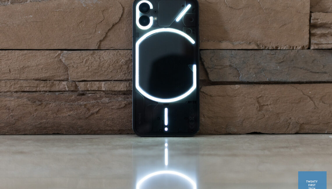
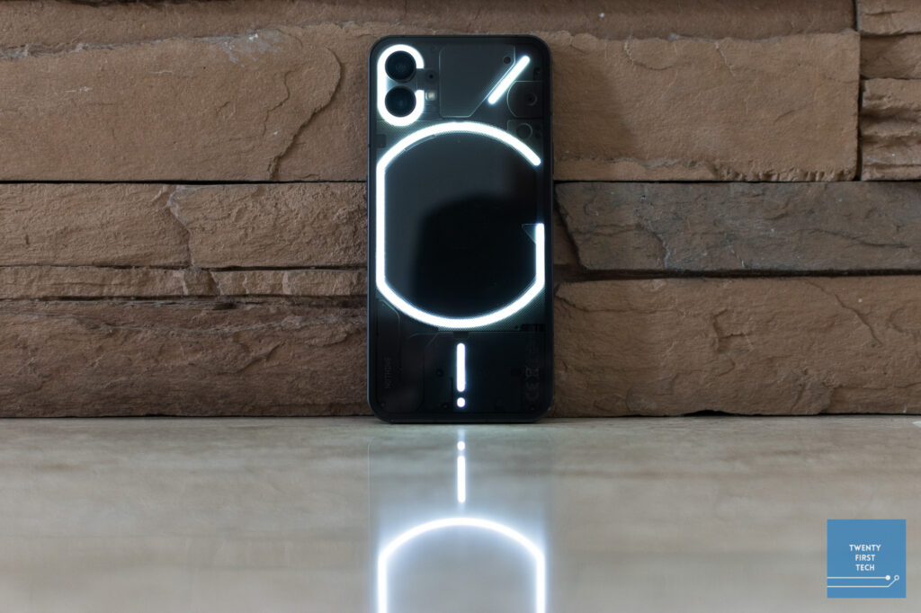
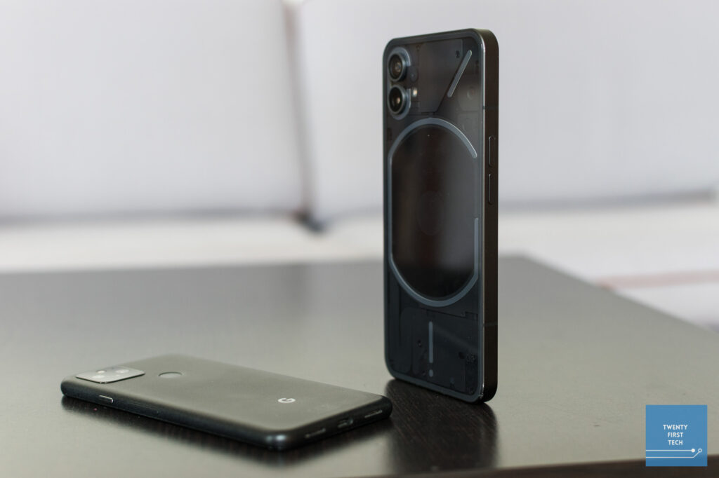
Nothing marketing leaned heavily into the Glyph lights, which are the pattern of white LEDs on the back of the phone. While they’re cool to look at, I’ve found them to not be very practical.
In terms of functionality, you can set a light pattern for when you receive a notification, which you will be able to see with phone face-down on a table. However, there’s no way of telling which app the notification is from, which you would be able to do (on this phone and every other Android phone) if you had set the phone face-up.
You can customise the light pattern for when specific contacts call you. But this is once again worse than just leaving your phone face-up, because then you’d actually be able to just see who is calling you, instead of trying to decipher who it is from the pattern of light flashes.
Furthermore, the Glyph lights blink at the moment when a notification comes in, and that’s it. There’s no more indication telling you that you have a notification waiting. In that sense, the notification LEDs that were standard on Android phones pre-2018 provided better functionality, as their constant subtle pulsing informed you that you had a notification waiting, not just of the moment you receive a notification. (And as a bonus, the colour of the LED also lent some indication as to which app the notification is from.) The Glyph lights are thus the antithesis of the old notification LEDs — flashy but with no function, as opposed to being subtle and practical.
Eventually, I found the Glyph lights to be not useful, and even a distraction/nuisance as the lights were very bright even at the minimum brightness setting. I ended up turning the feature off entirely.
To be clear, this does not detract from the experience of using a Nothing Phone. It’s just an extra feature that has little practical use. But perhaps it’s time to bring back notification LEDs?
What I’m on the fence about
Design
I would like to caveat this by saying that I’m not a big phone person, and the Nothing Phone is definitely a big phone. Hence, my usual complaints – it’s too heavy, and too large for one-handed use.
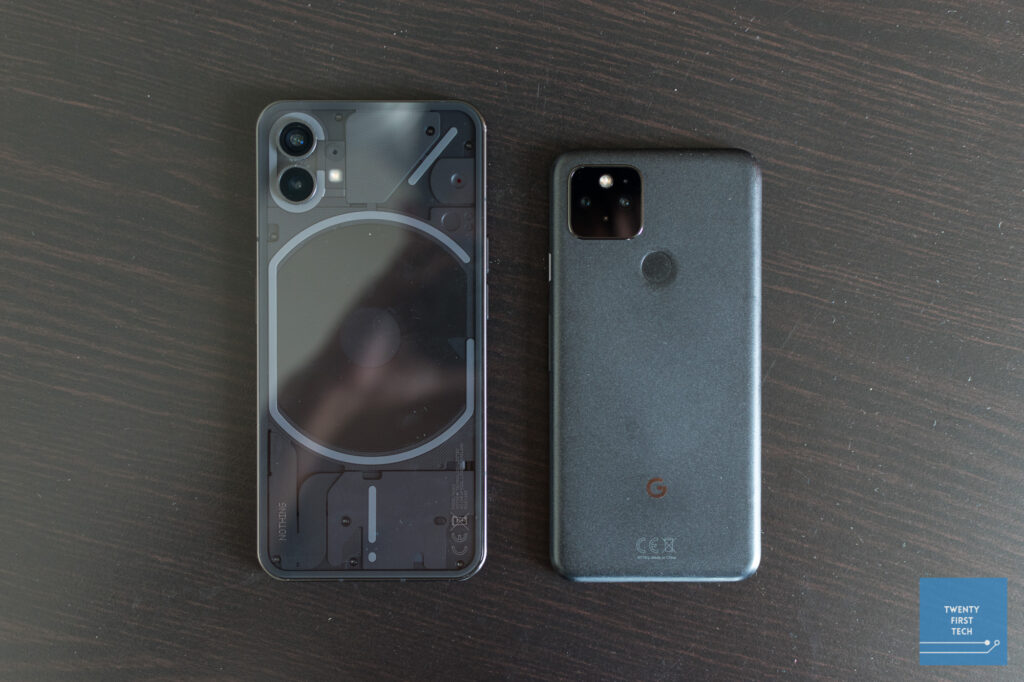
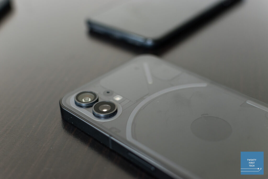
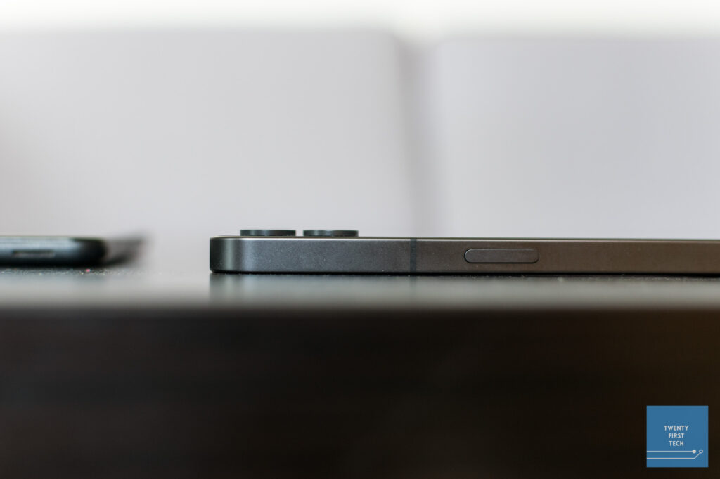
In terms of aesthetics, it basically looks like an iPhone 13 Pro Max with a transparent back and hole punch camera instead of a notch. Their dimensions are comparable as well, though the Nothing Phone weighs much less (194g vs 240g). Similarity to the iPhone aside, I think the Nothing Phone looks clean, especially with its symmetrical bezels on the front, brushed aluminium rails, and transparent back.
However, while the flat sides look good, they are a pain to grip. The transparent glass back looks cool, but also makes the phone extremely slippery on flat surfaces. As with the Glyph lights, this seems like a case of form over function.
Cameras
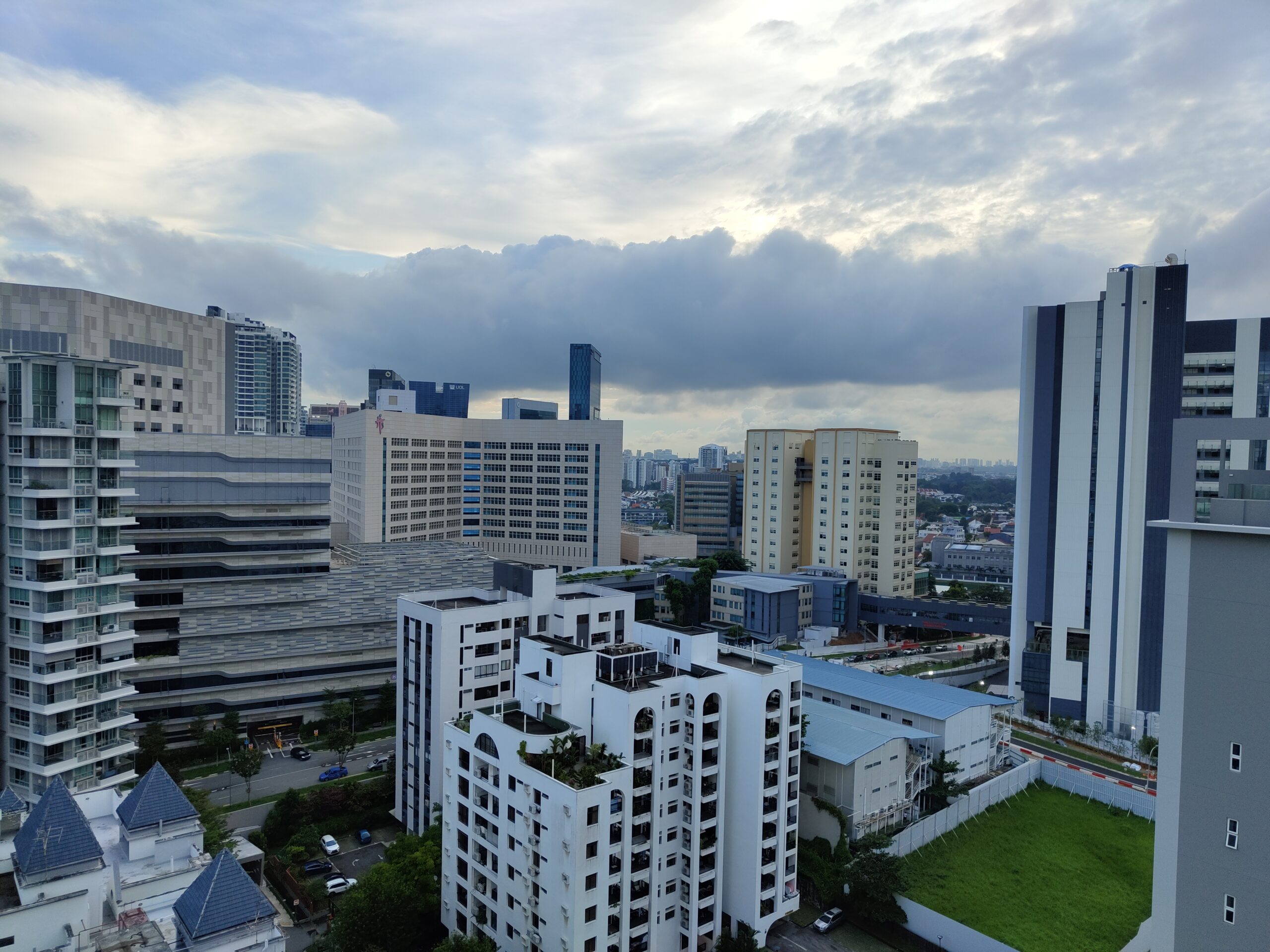
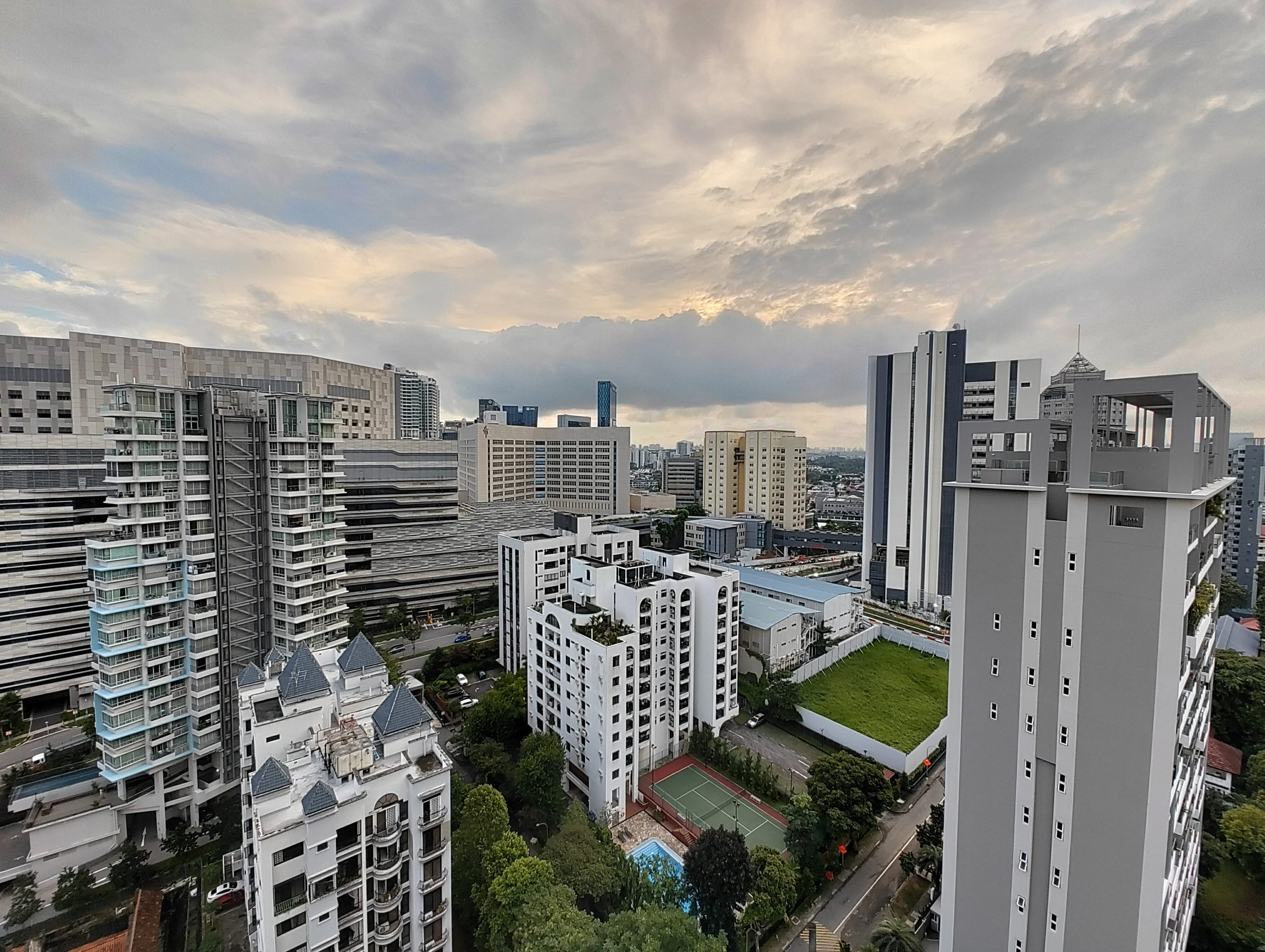
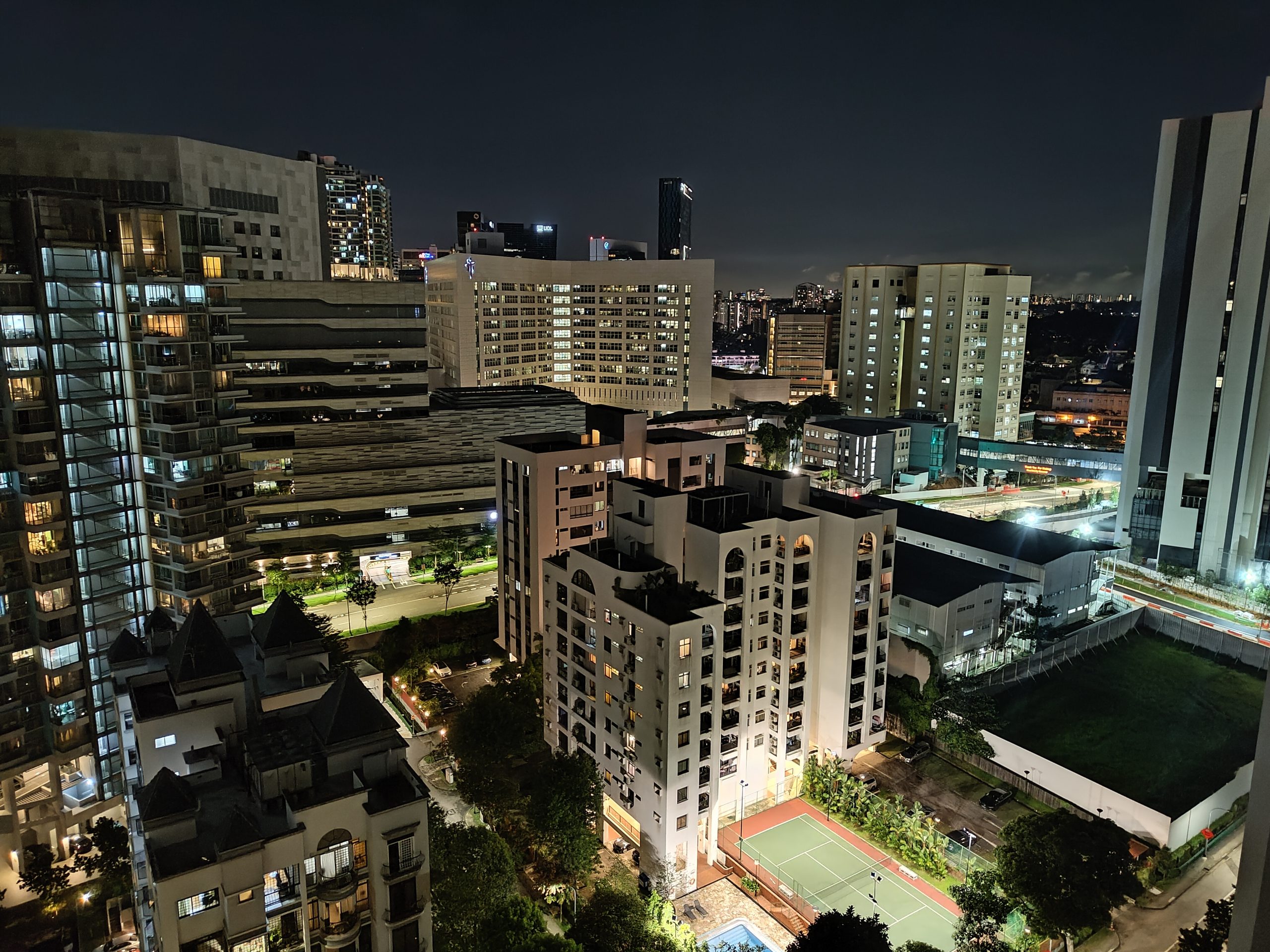
Cameras on the Nothing Phone (1) are decent but not great. In bright lighting, photos from the main camera are clean and colours are natural. In low light, images from the main camera still hold up, but issues start to appear such as low dynamic range (highlights being blown out).
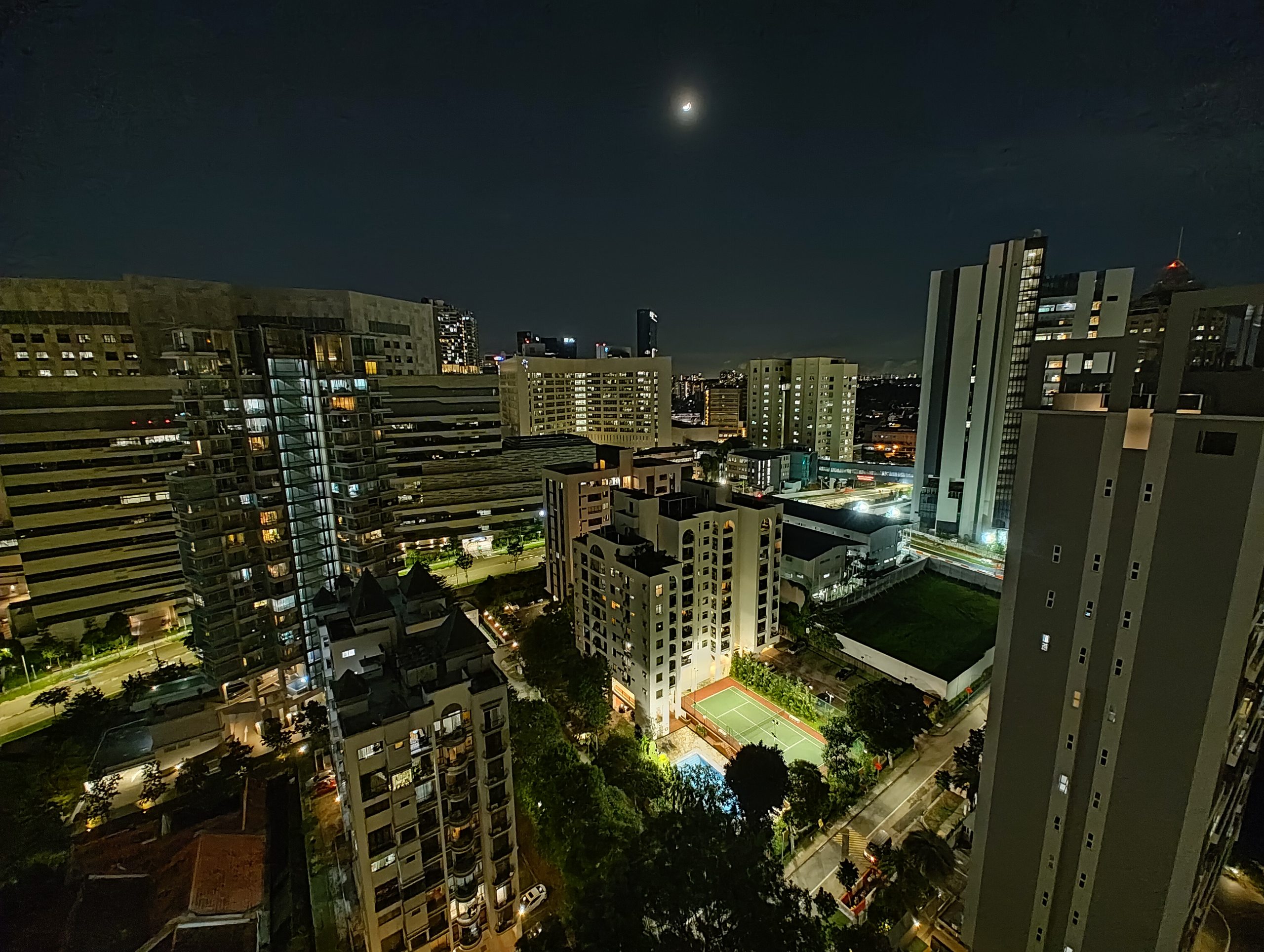
The ultrawide camera performs poorly compared to the main camera. Even in bright daylight, images are noticeably blurrier and less detailed. Images taken at night have an oil painting effect — noisy, lacking detail, and poor dynamic range.
Perhaps the greatest issue is the significant difference in colour processing for the two cameras. Images on the main camera look noticeably cooler compared to the ultrawide in the same scene.
Overall, decent main camera, poor ultrawide.
Pricing & Conclusion
The Nothing Phone (1) provides a great display, good battery life, and a unique design. However, the software bugs and questionable software support has me cautious about recommending the phone wholeheartedly. If you aren’t too concerned about software, the Nothing Phone (1) is a respectable package for the price point. Just note that you can get better cameras elsewhere, and the Glyph lights are mostly a party trick with little practical use.
The Nothing Phone retails for S$769 (8/128 GB), S$869 (8/256 GB), and S$949 (12/256 GB). Personally, I think the cheapest configuration is the best deal out of the lot, and is the one that I would recommend. Note that the cheapest configuration only comes in Black, while the other two options come in either White or Black.
You can purchase the Nothing Phone (1) from Shopee, Lazada, Metapod, or Challenger.
As always, when purchasing online, check if you can get additional cashback on your purchase with ShopBack. You can also check out our deals page for more Singapore deals.
Liked this review? Follow us on Facebook, Twitter or Instagram for more updates!

